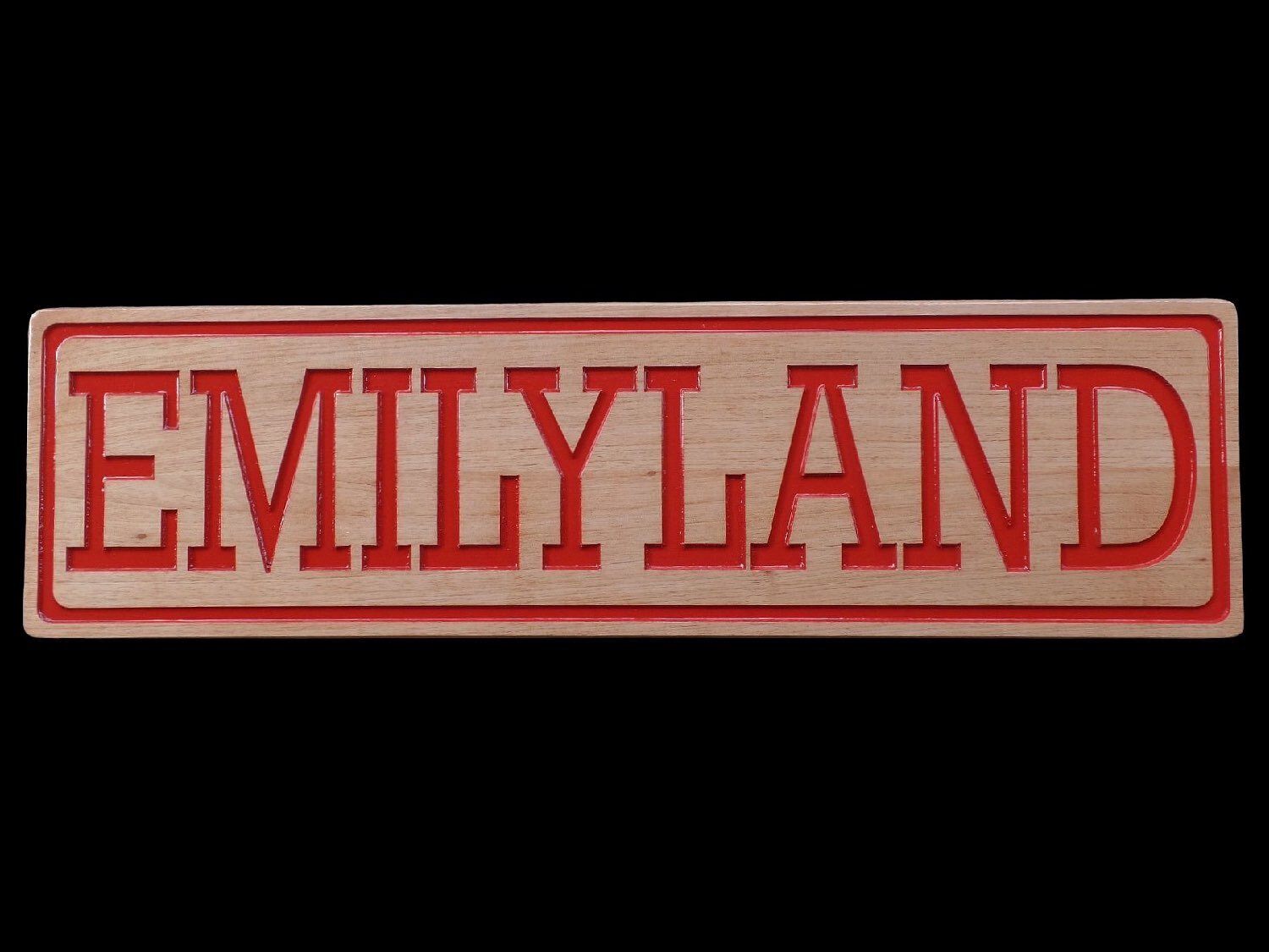
Fonts for Signs
Size Matters
1 inch is the minimum height to be able to see and read any lettering on a wood sign at 10 feet away. Thinner letters can be smaller, but as you add thickness (bold vs. regular) to the letters, height should increase as well. View a legibility chart
We Don’t Charge by the Letter
Say as much as you want, but succinct is best. An overcrowded sign just looks bad. We'll make it, but you won't love it. Choose your words carefully. Naturally, the more words, the bigger the sign.
Name Your Font
Providing the name of the font you want is very helpful. The fonts samples here work well for signs, but we can source all types of fonts.
If you’re looking for something else, use our contact form to describe it and send us a picture of something you like. Use descriptive terms such as: rustic, child's handwriting, script, comical, western, etc. We are happy to choose a font and a font size for you. We've been doing this for years, and with your direction, we can help you make the right choice.
You may also find fonts at Dafont.com. There, you can type in your sample text to see how it might look.
Simple Lettering Shows Up Better
Too fancy and your sign will be hard to read. Should you choose a more decorative font, we recommend using it at a larger size, which in turn will often require a larger sign.
Font Adjustments
We can made fonts smaller, taller, thicker, or thinner. We can also set the font at a curve or angle, or invert, shadow, underline, etc.
Font Color
The font color you choose makes a big difference. Dark woods need need lighter lettering; light woods do better with dark lettering. Contrast makes the sign more visible and readable.
Outdoor Signs
If your sign needs to visible in an outdoor or night time setting, we strongly encourage adding a reflective coating that can be added to the lettering. The coating is identical to what cities use to make the words and lines painted on streets visible to drivers, giving the markings a reflective sparkle. It only works on white paint, and there is a small additional charge.
Serif
A serif is a small line or stroke attached to the end of a larger stroke in a letter. Depending on the font, it can feel more traditional and may help with readability.
Popular serif fonts: Times Roman, Courier, New Century Schoolbook, and Palatino.
San Serif
Depending on the font, sans serif may feel more modern, yet may be difficult to read without the serifs. This is highly dependent on overall design, such as number of words, spacing and colors.
Popular sans serif fonts: Helvetica, Avant Garde, Arial, and Geneva.
Decorative
There are all types of fonts beyond the basic serif or san serif. This category is just to give you an idea, and it includes: scripts, fonts with extreme features (swishes or exaggerated serifs), and other fancy features.


